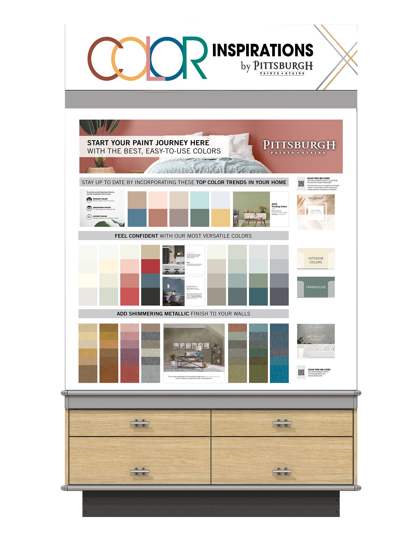
Color Inspirations Display


Menards required a display retrofit, and Pittsburgh Paints & Stains seized the opportunity to compete with DutchBoy for this placement. I conceived and branded the "Color Inspirations" display, ultimately securing the Menards business and obtaining the display placement.
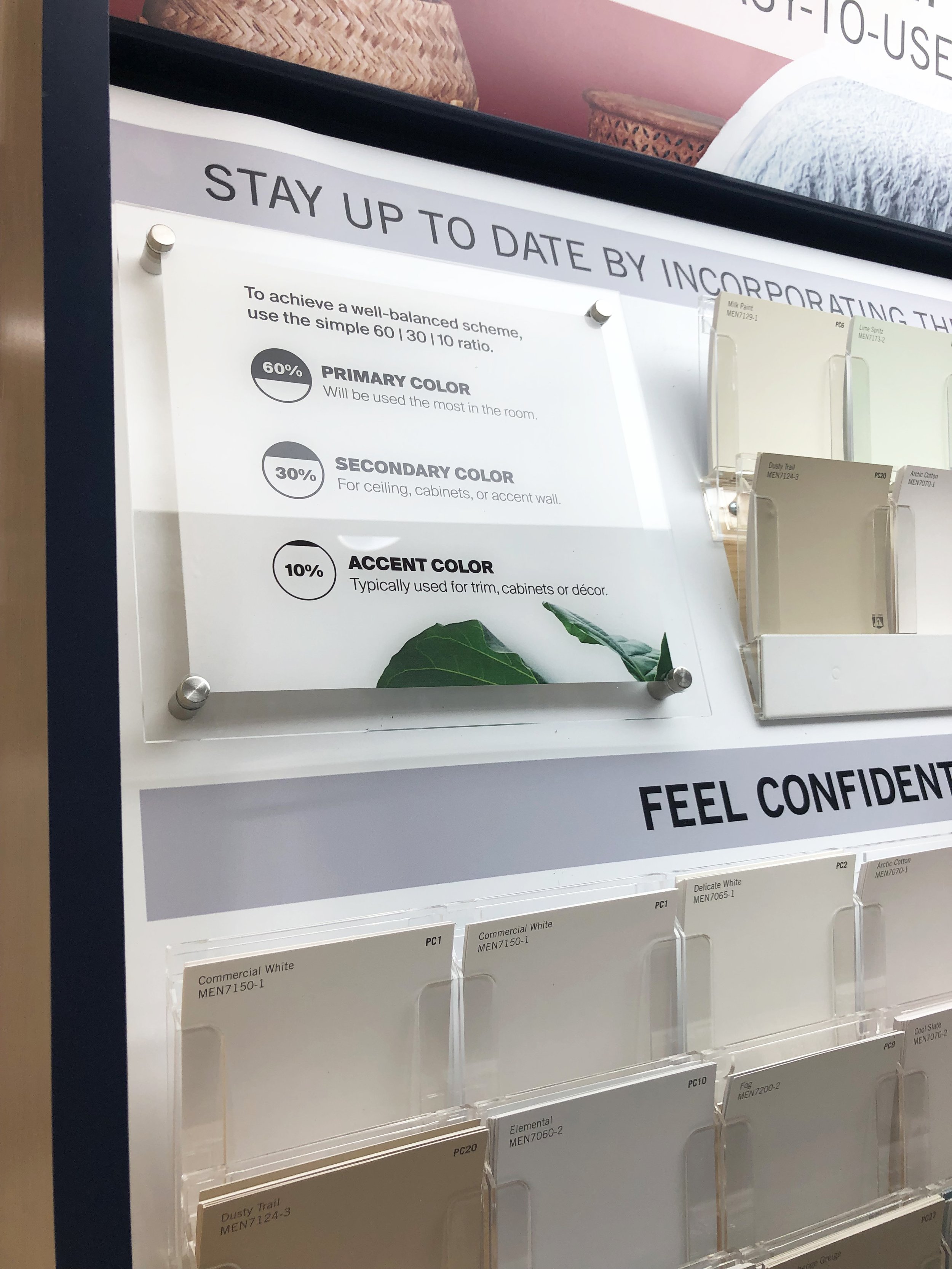
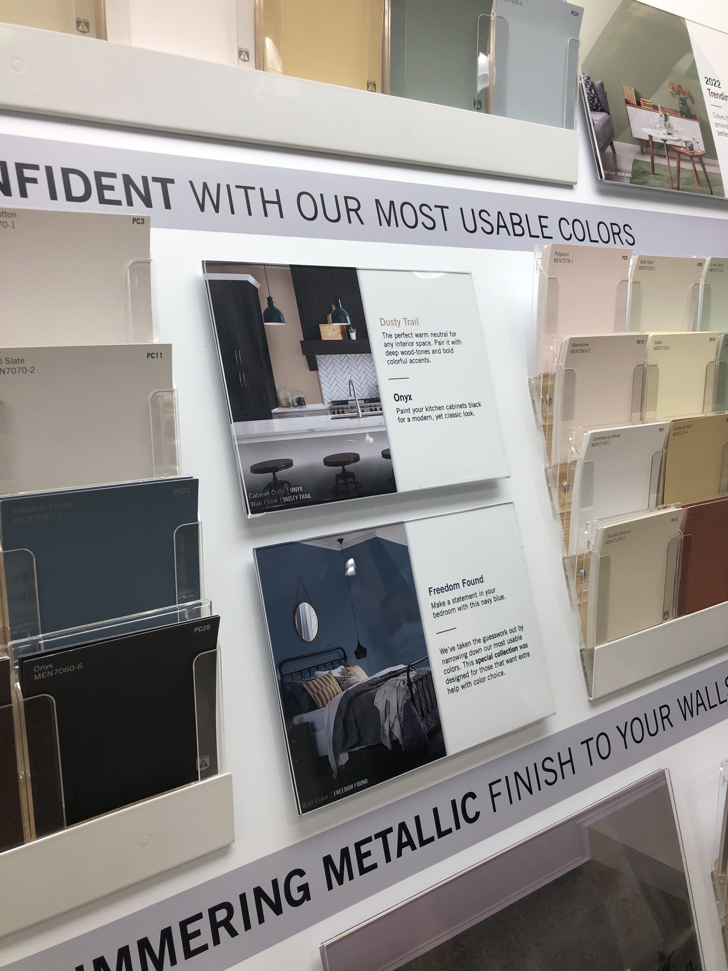
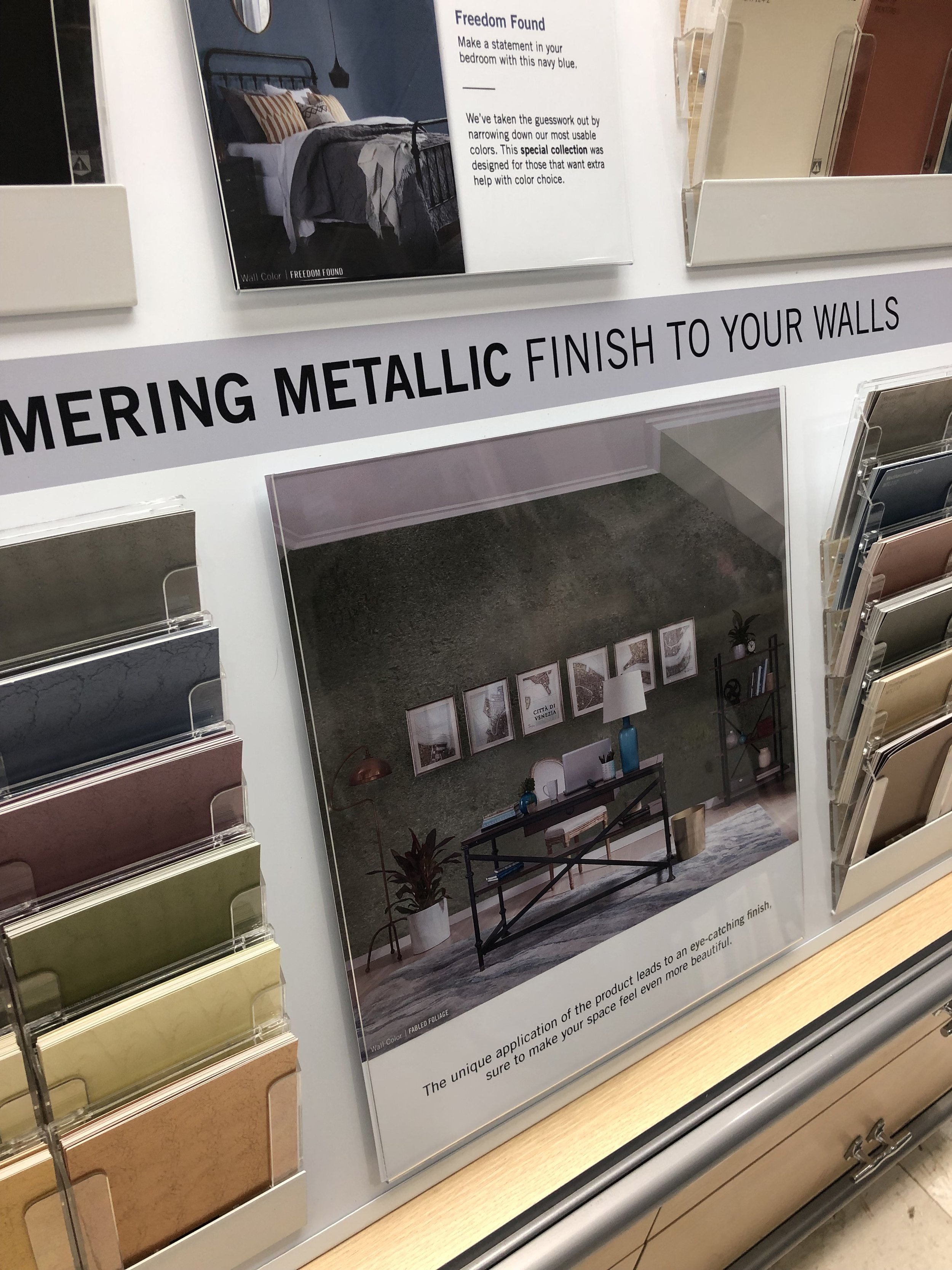
To tackle this challenge, I was tasked with designing a logo for the display, known as COLOR INSPIRATIONS, to serve as the header. Furthermore, I collaborated with third-party engineers during the redesign of the display to ensure that chip holders, brochure pockets, and glass panels would remain within budget constraints.
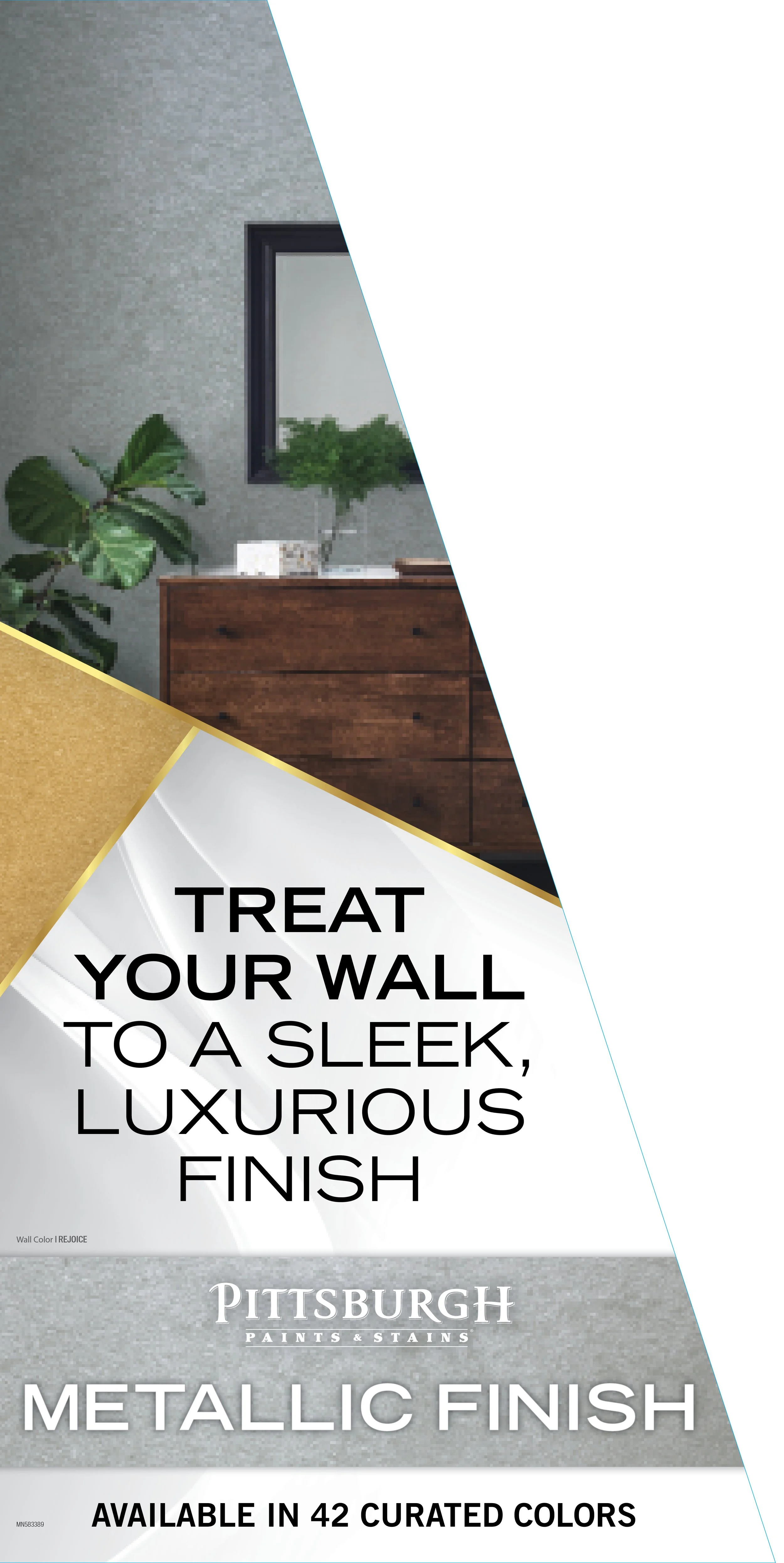
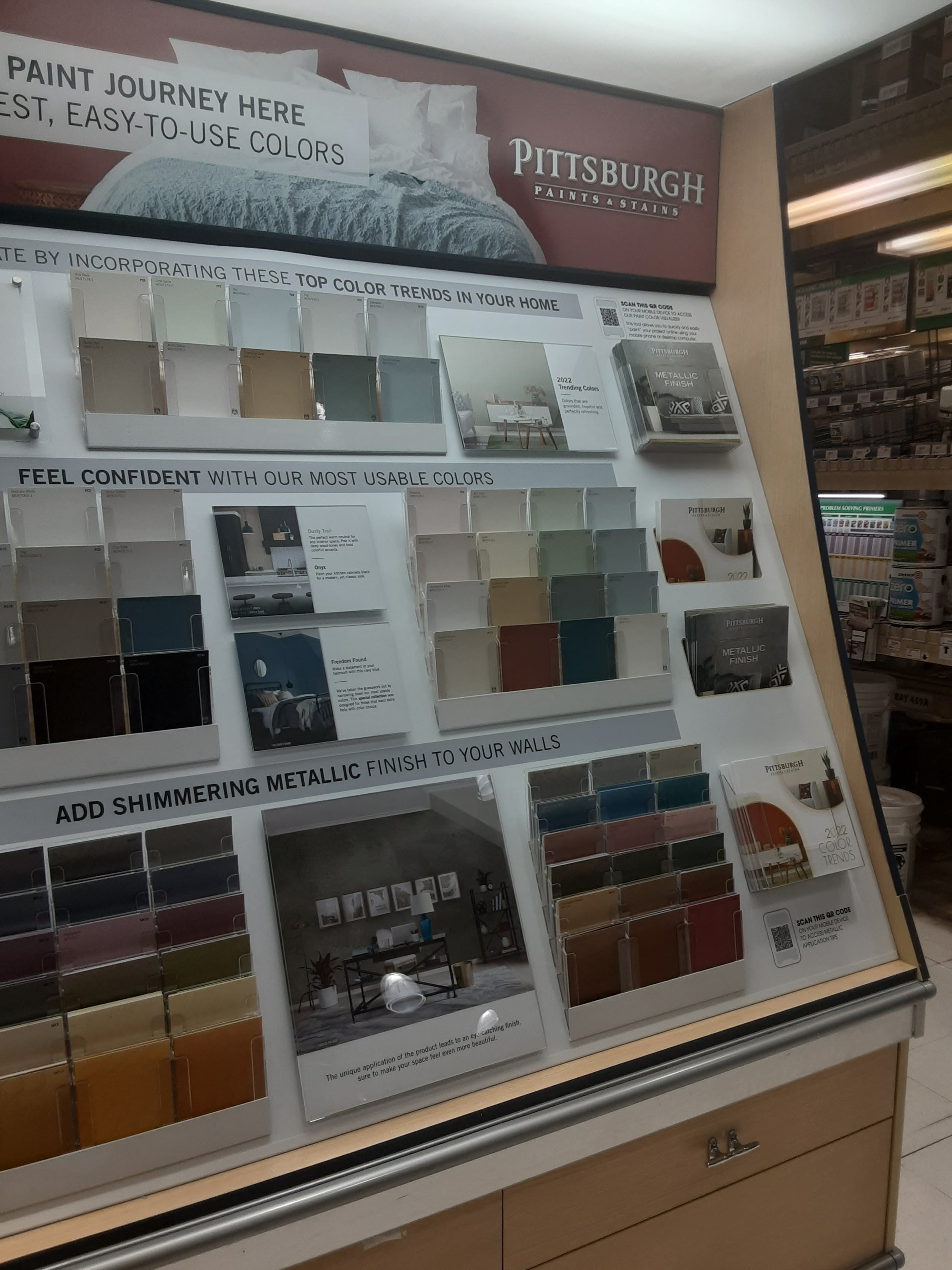
Additionally, I was responsible for creating two supplementary brochures for the display: one showcasing trending colors and the other highlighting metallic chips . I also designed the graphics to be displayed above the header and behind the glass panels, as well as a side decal graphic to promote our metallic paint.
Furthermore, we established a trends power aisle where consumers would walk into from the display, featuring our paint products with informative headers and panels. The design was a collaborative effort with another team member. She handled the insert panels on the left, while I created the header boards to be placed above the products on the right.
Color of the Year Brochure
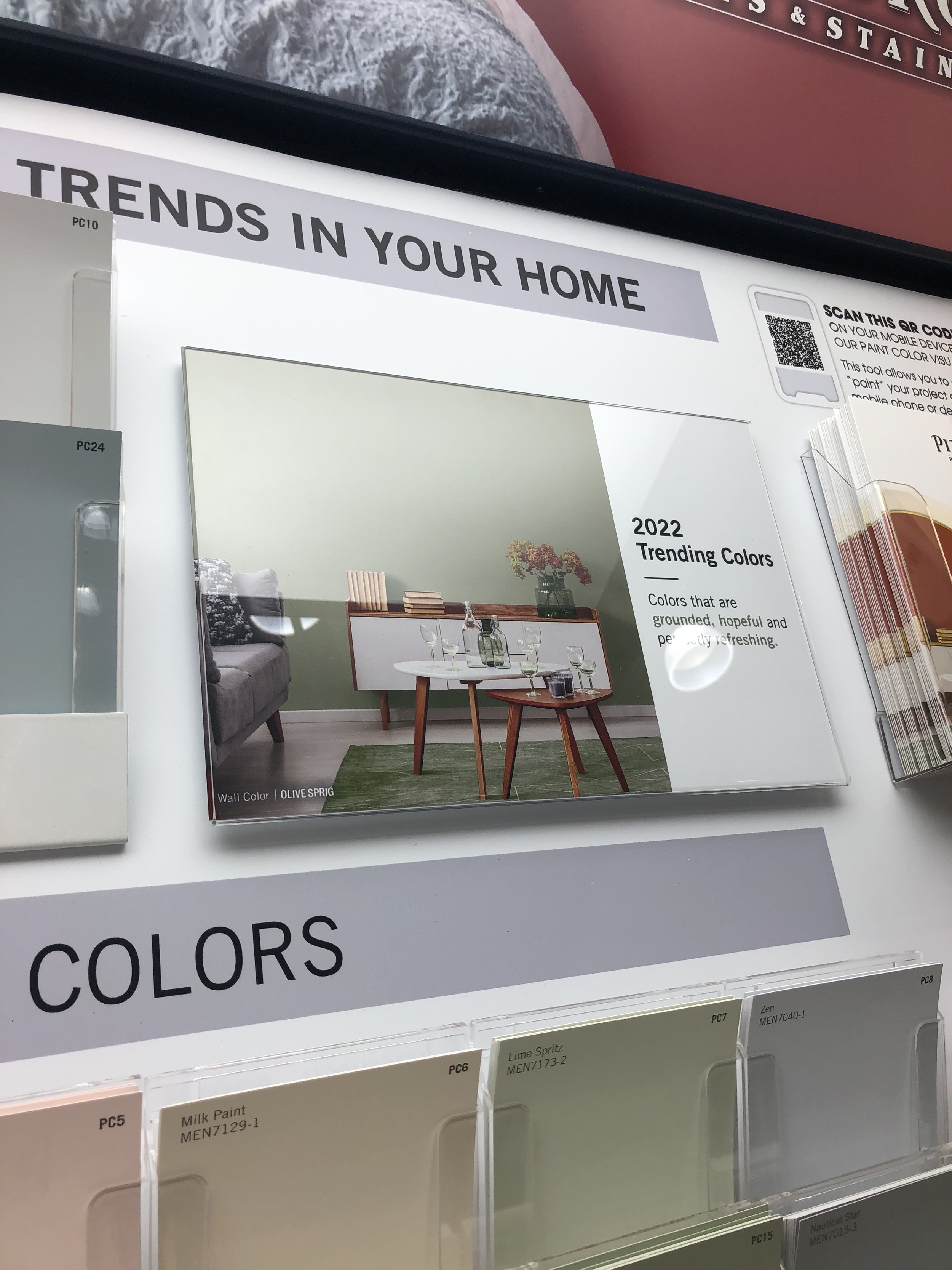
This brochure goes on the first slot of the color center, next to the trending color palette color chips


Metallics Brochure
This brochure sits on the lat slot of the color center, next to the metallic chips at the bottom.

2022 Trending Color Power Aisle
A collaborated effort of the 2022 trending color power aisle. This aisle sits next to the color center.